Watch it!
Watch it!
Overview:
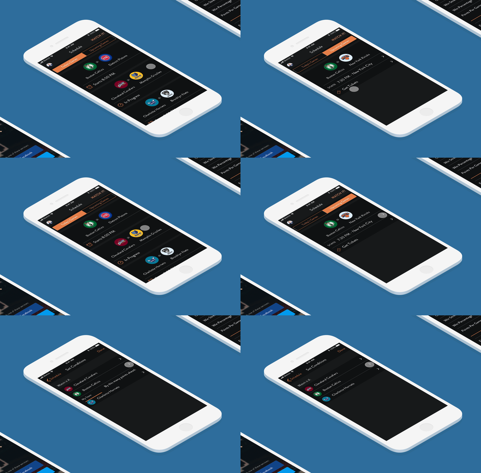
To get more experience with app design and prototyping, I designed an iOS app that informs a user if an upcoming basketball game is worth watching based on the parameters they have set for a specific team or match. This also helped me learn how to create an animated prototype.
Client:
Personal
Role:
Product Design, UX+UI Design, and Prototyping
Concept:
As an avid NBA fan, I would always watch a game featuring my favorite team or players. However, there are some days that I can’t watch a full game due to my busy life or thinking that one team is better than the other it’ll probably be an underwhelming match to watch. Those games that I decide not to watch or miss out on would eventually be close and exciting games which would leave me feeling regret not watching them live. That’s why I designed an app that will help me never miss out on NBA games worth watching.
How the app will work is simple, it will alert the user to watch a game based on certain set conditions. For example, you can have your phone send you a notification to watch a game based on how many points your favorite team is winning against their opponent.
User Flow:
To make this app come to fruition I started off by creating a simple user flow to show the path a user will follow when interacting with the app.
Wireframing:
After creating the user flow, I went on and sketched some low-fidelity wireframes of the app. I presented my sketches to some friends who were also interested in basketball and conducted a user testing session with each of them. The feedback I received from them was mostly positive as they understood how to flow through the wireframes. Additionally, I converted the sketches to mid-fidelity wireframes for user testing in case the sketches weren’t clear to follow and to see if I can get any more feedback.

High-fidelity Mockup and Prototype:
After reviewing the feedback from my low-fidelity wireframes, the next step was to create high-fidelity mockups for the presentation. I had to decide on the visual patterns and assets to include in the app. I set the colors mainly to shades of orange and black similar to the colors of a basketball. The san-serif text would be mainly white so it could be easier to see with a dark background. I then created a clickable prototype to present to users for usability in case there need to be revisions for the app. Also, I made an animated prototype to convey my vision of how the app will work in motion.
Thoughts and Conclusion:
This was one of my first app design projects so I understand that I could be missing some UX steps when beginning to design the app. In terms of following a UX design thinking approach, I would be missing the research phase to define the users as well as conduct user evaluations.
It wasn’t possible to include research during the design process because I was given a short amount of time to complete this project. However, I believe doing research wouldn’t have made much impact on the overall design since this app stemmed from an idea I had and from my insight into the capabilities of the smartphone while taking advantage of its notification features. If anything, the only user research I would have received was the user feedback during user testing sessions for my wireframes and prototypes.
If this project was done in a real work environment using the steps I’ve taken in terms of designing this app, it could be comparable to following an Agile UX approach. If plausible, UX research activities should be done ahead of development sprints. The app would be designed quickly in a sprint and then the prototype launched to the consumer to ensure usability. Any feedback received from the first prototype would be considered for the next sprint. Furthermore, I would say that getting feedback during the design sprint can be a quicker form of user research overall.
