Smart Travel
Smart Travel
Overview:
Challenged myself to design an app with a certain set of conditions. I had to design an app based on a random subject and platform to work on. I designed a Travel app for a Smart TV while incorporating UX design process and principles I have learned over time.
Client:
Personal
Role:
Product Design, UX Research, Usability Testing, UX+UI Design and Prototyping
Concept:
Have you ever wanted to go somewhere for vacation while watching something on your Smart TV? You would need to go rely on devices like your smartphone or laptop to plan your travel. Using Travel websites and mobile apps can be a great option, but why not just do it on your Smart TV? I have designed the Smart Travel app that will help you plan and book your next trip without leaving your TV. A simple app that will guide you during your travel planning phase with various information about your future trip destination.
Design Process:
To design this app I used Design thinking framework with Lean UX principles to make sure my decisions were supported by user research and feedback.

Research:
First I wanted to know if there were actually users who book or plan their travels using an app. I researched various articles and reports that included such information and came across a 2015 TripBarometer Connected Traveler report that was conducted on behalf of TripAdvisor. This global report defined people who used smartphones to plan or book a trip as Connected Travelers and provided insight into their habits and behaviors. The report had more than 44,000 global responses from travelers and the hotel sector.
Some key findings from the report:
45% of Connected Travelers usually use their smartphones to book activities for a trip, while 55% say they use a laptop.
44% of Connected Travelers are more likely to want their smartphones with them on vacation to organize their trip more efficiently and 37% book accommodation on the go.
While in their destination, 72% of Connected Travelers use their mobile to look for restaurants, 67% use it to find things to do and 64% use it to read reviews.
Overall it revealed that there is a growing trend in booking travel via mobile apps and for Connected Travelers smartphones have become an essential companion when traveling.
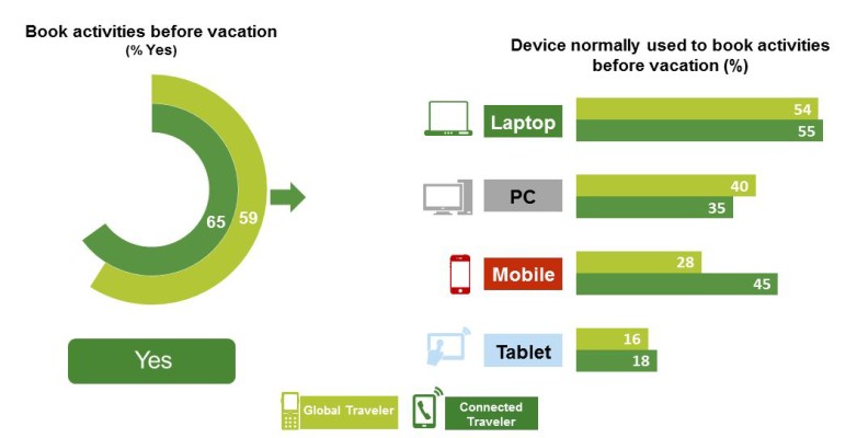
TripAdvisor’s 2015 TripBarometer Connected Traveler Infographic
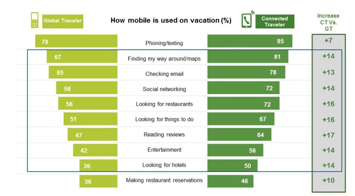
TripAdvisor’s 2015 TripBarometer Connected Traveler Infographic
User Research:
After researching Travel app usage among Travelers, I decided to conduct my own user survey and interviews to get more information about users who use Travel apps in general and Smart TV owners who have experience using apps in their TV.
Key findings from the user research:
More than half of the respondents have used Travel apps
Most of the respondents like to use Travel apps to read destination reviews.
Travel apps were also useful to book affordable flights and hotels.
A lot of respondents hate Travel apps that are difficult to navigate and have no prices listed.
At most there were half of the respondents who own a Smart TV.
Users like how integrated apps in their Smart TV are simple and easy to use.
Competitive Analysis:
Since there were no Travel apps available on a Smart TV I researched popular Travel apps for mobile. After having users and myself test these apps, I would analyze features that were good and bad. These features will then be used as a reference when designing my Travel app.
Persona:
After consolidating my research analysis I was able to create the ideal users for the app. These personas help me understand the user’s needs and goals.
Storyboard:
I drew a simple albeit basic scenario on a storyboard to illustrate how a user interacts with the application. The storyboard helps me to focus on what I need to include in my app design.

User Flow:
In order to go in-depth with how a user interacts with the app I created a user flow. The user flow helps visualize the path a user has to follow through the app to complete a task.
Ideation:
I came up with lots of ideas on how I should design the app. The ideas derived from solving problems and answering questions related to the user, Smart TVs, and Travel apps in general. I then used those ideas to help define features to include in my design:
Simple Navigation: Able to easily navigate the process of booking a trip on your Smart TV
Profile Customization: Create and edit your personal information such as the number of people you will be traveling with on your trip.
Grid View: Account for browsing travel options in a grid instead of a list for easier viewing.
Popular Destinations: Option to choose popular places that users have booked using the app.
Search Option: Allow users to search for a specific location.
Read Reviews: Able to read different reviews for the destination you are planning to travel to.
Booking Variations: Users can book flights and hotels based on prices and ratings.
Design Considerations and Limitations:
Before designing the UI for the app I had to think about the construction of a Smart TV in general and how a user interacts with an app on the device. Rather than having a touchscreen or a clickable cursor, a user has a remote to navigate through an app on their TV.
When designing the UI I had to consider the following:
Where on a Smart TV screen can my UI function with a remote?
The overall dimensions I am able to design my UI and fill on screen.
How I am going to navigate through the app while only using the basic buttons on the remote?
Sketching, Wireframing and Testing:
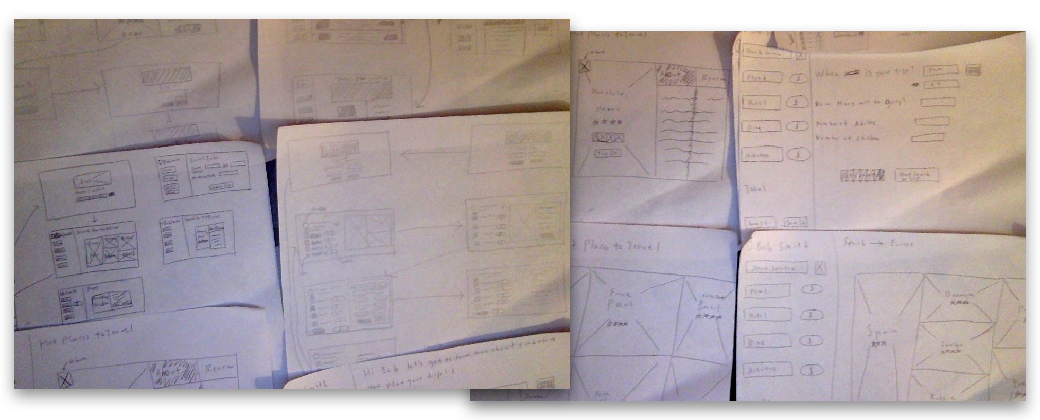
In the beginning stages of designing the UI, many forms of low-fidelity wireframes were sketched out on paper. They were created for early user testing to get quick initial feedback and then refine my thinking for how the layout and content should be structured effectively. After figuring out a clear blueprint for the app design from the sketches, I used them as a guide to making digital mid-fidelity wireframes. Different iterations of mid-fidelity wireframes were created based on user testing feedback. Additionally, another user testing session was created for the high-fidelity wireframes that included color and design assets.
All of these user testing sessions were important in order to understand the user’s behavior and identify any issues, strengths, and opportunities for further enhancement of the app.
Brand Style Guide:
A comprehensive collection of app components and UI patterns was incorporated into my final design.
Final Design and Prototype:
I created high-fidelity mockups to present as the final design. Using feedback from the user testing sessions for the wireframes, I made changes or improvements with regard to the visuals, colors, and other design issues:
Users didn’t like how there was too much information on the left sidebar, so I stripped down the text and made it more simple.
Added a panel behind the content information so it looks like everything is connected to form a dashboard.
Used a monochromatic color scheme for the overall dashboard.
Included subtle drop shadows for each content panel or button as a visual signifier that they can be pressed down.
I’ve also created a clickable prototype to display the whole process of planning and booking a trip in the app. Click on the button below to try the prototype as well as view the final designs for each high-fidelity mockup screen that I’ve created for the app.
Animated Prototypes:
I also created some animated prototypes to present what I envision the app will look like in motion. These animations were thought with the user in mind to have a simple, yet easy experience while using this app on a Smart TV. Also, it is easier for me to communicate any complex animation visually to a user or developer rather than explaining it verbally or written in text.
Thoughts and Conclusion:
Smart Travel is a simple travel app on your Smart TV in which you can plan and book your next travel destination. Just create a profile and start your next trip with the best flight plan, hotel stay, and fun activities of your choosing.
Looking back on the design process for this app, one of the most important lessons learned along the way was being empathetic with the user. The concept and design decisions for this app came from understanding and communicating with others and not relying on my own personal biases. Furthermore, designing this app as a minimal viable product for launch and presentation was an interesting challenge because this was my first time shifting my focus away from mobile and web to a Smart TV platform. I had to consider the features of a Smart TV and think about how a user will control the app with the TV remote.
While the usability test feedback for the final design was mostly positive, I can still see parts that can be improved. In the future, I’d like to flesh out some features in the app such as adding more customization for the user’s profile and having an advanced destination search filter. I would also like to include more travel options like restaurant and cruise booking. I plan to continue doing iterative cycles of user testing in order to use the feedback to update the design and prototype for development.
