Fit Find
Sed vitae enim egestas, congue arcu et, efficitur augue. Cras sit amet venenatis est. Sed pulvinar sodales lacus sit amet placerat. Nulla facilisi. Integer pellentesque semper magna vel pellentesque. Cras imperdiet tortor sit amet erat aliquet rutrum.
Fit Find
Overview:
Took part in designing a photo-sharing app for a startup that allows you to search for clothes that will fit your body type before buying them. The user will check out uploaded photos of clothes worn by other users with a similar body type as a reference.
Client:
Fit Find
Role:
Product Design, UX+UI Design, Prototyping and Web Design
Solution:
Fit Find is a photo-sharing app that will help decrease the intimidation factor of online shopping for clothes. A user will be able to search for an article of specific clothing they are thinking of buying and look at photos of users who are wearing it. Additionally, the app will match your body proportions with other users who are similar so you can view photos of clothes they have worn before you decide to purchase them.
Problem:
I love online shopping for clothes because of the bargain prices and the convenience of buying items in the comfort of my own home. However, I’m always worried that they won’t fit when I receive them. It’s possible to ship them back, but it becomes a hassle and some online clothes are not returnable. Also looking at a size chart for a specific brand can be misleading and wrong because everyone has a different body dimension.
User Research:
Following a Lean UX Design thinking approach when designing this app, I first needed to define the user, but I decided to not limit the survey to only those who only shop online. I opened it up to anyone because this should be an app that anyone can use - even if they don’t have a passion for fashion, are curious about a certain fit for an article of clothing, or are interested in what fashion styles are popular. So I created a user survey to learn, among other things, the following:
Are they interested in fashion;
How often do they shop for clothes;
Do they prefer to shop online or at a physical store;
Where are their favorite places to shop online or in any physical store;
What do they hate and like about shopping in general;
The reason they prefer to shop online;
What do they hate or love about online shopping;
What types of apps do they use that has an easy and familiar search experience;
Important things they appreciate or consider when using any photo-sharing app;
The survey was distributed across social media and online forums and completed by nearly 50 respondents. Main takeaways from the responses:
65% surveyed were interested in fashion.
55% of respondents shop for clothes every season, 30% every month, 15%, every few months
Of the respondents, 45% had no preference for where they prefer to shop while 35% preferred online shopping.
It was surprising that 71% didn’t like how one brand’s clothing size was different from another brand's.
62% of respondents like to shop online for discounts and 30% like it for convenience.
Shipping was one of the main reasons for loving and hating online shopping.
78% of users use Instagram, so they wanted an experience to be familiar with this app for how simple it is to use.
Ease of use and simplicity were things respondents like in a photo-sharing app.
Competitive Analysis:
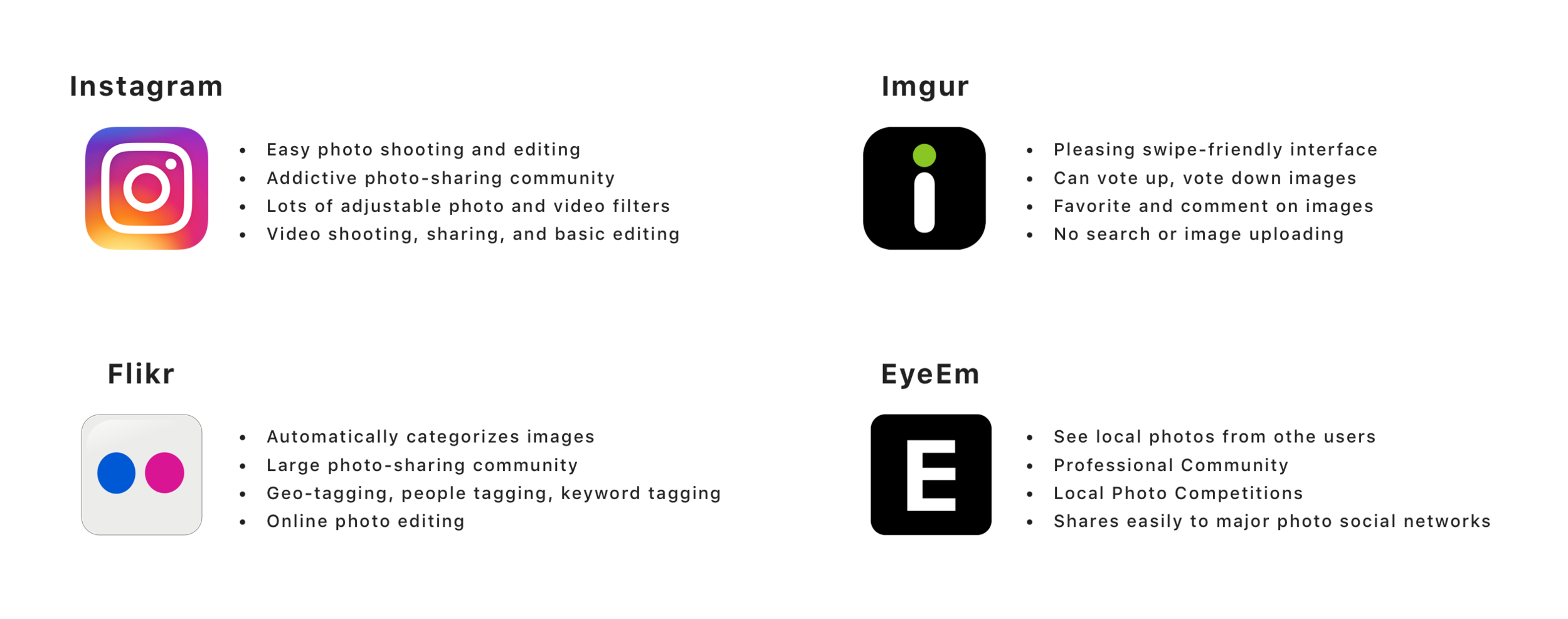
There are many photo-sharing apps on the market. I did not find any of them related to fashion so I focused on apps that mainly focused on photo sharing. I had users test these apps took a look into areas where they were doing well and analyzed their features to help determine what effective features I think my app should incorporate.

Personas:
After analyzing information from the survey and market competition I was able to determine the target user groups for this app. By creating personas I can understand the users’ behavior patterns, needs and frustrations.
User Flows:
Having defined my users the next step was to think about and create user flows for different scenarios. The user flows help to visualize the interaction the user has with the app in order to complete a certain task.
Ideation:
Using information from the research phase and the user flows that I created, I went on to brainstorm ideas for the app design. I started by writing down ideas in the form of answers to questions about the app or solutions to problems that will come up for the user. Then, I analyzed the best ideas and bring them forward to create and specify features that I will include during the design phase.
Some features to include:
Search Brands: Able to look up a specific brand and the result will be based on clothing type categories.
User Setup: During Sign Up users will have to input their body measurements in order to be matched with users with similar body proportions.
Discover: View different fashion style photos from users with a similar body type from three sections: Relevant, Trending, and Fresh.
Upload and Share: Users can take photos of their clothes fitting on them and share them with others.
Connect: Availability for users to follow other users to view more of their fashion style. Also, have an option to communicate with each other by liking and commenting on their photos.
Information Architecture, Wireframes and Testing:
To begin designing the user interface I started off by creating a sitemap to frame the structure of the mobile app. I decided on what features to include or remove, and how each screen will be grouped and organized.
I then sketched low-fidelity wireframes to explore the initial concepts of the UI layout. The sketches were also used to communicate visual ideas to users during an early user testing session. One of the main goals in mind during the sketching phase was to develop a similar search experience similar to other photo-sharing apps.
After generating and refining some solid ideas, I used them to create digital mid-fidelity wireframes. These wireframes were also used for user testing to determine what elements work within our layout, and which ones cause issues that can impact the user experience. For example, users wanted the user profile setup to look simpler instead of having one screen of text asking for measurement details. Based on the feedback, I refined the wireframes by splitting the user’s body and measurement details into different screens and included visuals to help the user figure out their body type.
Style Guide and Logo Design:
Through my user research, I decided to have the visuals look modern and simple. I used only one sans-serif typeface and chose colors that wouldn’t be difficult to see when combined or placed next to each other. I also created a collection of UI components to include in my design.
When creating Fit Find’s identity, it was important that the user instantly knew what the app was about. For the logo, I wanted to include some sort of tape measure in relation to the app’s function. Positive feedback from users was received for the logo’s simplicity with just the initial letters of the app name. In addition, users were successfully able to see that the logo was designed to look like pieces of tape measures combined together to form the letters.
Final Visual Design:
I consolidated the feedback from the mid-fidelity wireframes to establish and present the final design mockups and clickable prototypes. This included all the design assets and components developed and integrated into the final product. Also, I wanted the app at first to be mainly used on Android, so I tried to design the app using the Material Design language.
App Features:
Setup your Body Measurements
Complete a simple profile setup by adding your personal measurement details. The app will use your measurements to match with people similar in body proportions.
Search for clothes before buying
Use the search feature to find a specific clothing brand and clothing type. The app will then find photos of the searched clothing worn and uploaded by users who are close or similar in body proportions.
Snap and Share
Tap on the camera button on certain screens to take and upload your own clothing-fit pics. Share your personal style with your favorite clothes and have users like and comment on your photos.
Explore, Discover and Connect
View photos uploaded by users similar to your body type on your home screen. Discover new fashion styles that are relevant, trending or new. You can also connect with other users by following their profiles and commenting on or liking their uploaded photos.
Prototype:
Landing Page:
A website landing page was also desired for the final presentation to display more information about the app.
Conclusion:
Fit Find is an app that provides users with information about clothes they consider buying through a photo-sharing social network. It helps defeat the uncertainty of shopping for clothes online by allowing the user to see how clothes will fit other users that already purchased them. It has a quick and easy way to navigate through photos of clothes worn by people that have a similar body type as the user.
The final design presentation and user feedback from the clickable prototype made me realize that I can still improve upon this minimal viable product (MVP). The general feedback received was positive, but there was also feedback that I took into consideration for future designs of the app.
Features to think about including for the next iteration:
Design the UI based on iOS Design patterns.
Include user-uploaded measurements for each of their clothes.
Allow the ability to chat or send private messages with other users.
Categorize clothing brands based on price.
Overall I was satisfied with the process I took in designing this app by incorporating Lean UX design thinking and principles. In considering further improvements for the app and launching it into the market, I would expect there to be a continuous feedback loop during development to allow the app to evolve and improve with its users.
